Borrower Center
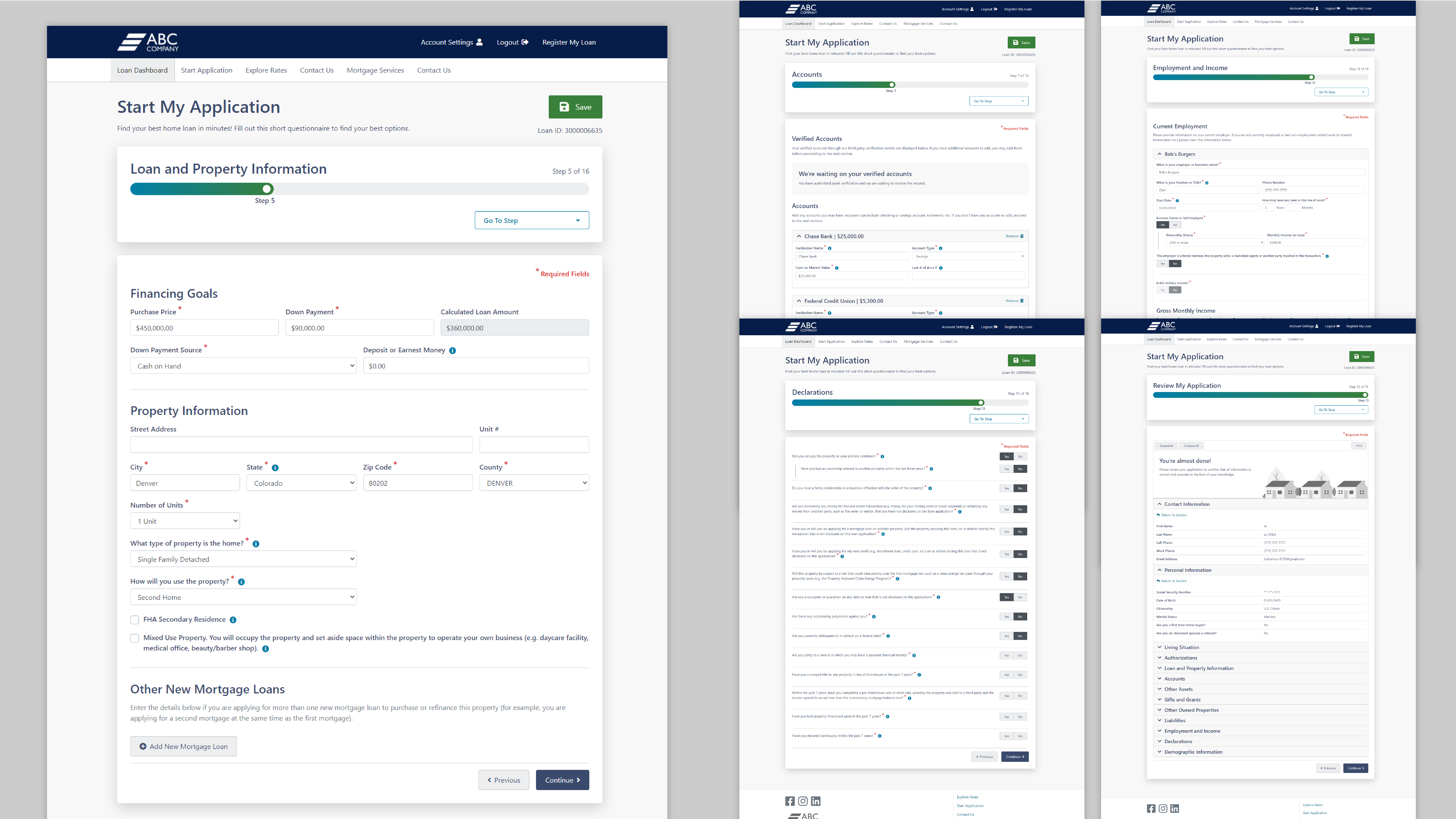
Buying a home in today's climate is a fraught experience... pandemic not withstanding. My goal with Borrower Center was to help craft and design a seamless digital application experience for our clients and their customers.Overview
My teams' main concerns focused on creating trust and transparency for both the borrower and lender. A borrower's goal is to fill out the loan application accurately and securely. They also need to track the progress of their loan, upload & sign documents directly through the web application. They want to get their loan completed as fast as possible and gain some transparency into the process. Meanwhile, our lenders needed an easy-to-setup web application that they could customize and configure the application to their company's products, as well as theming the site to match their brand.
Another goal for Mortgage Cadence was to ensure Borrower Center followed the ADA accessibility standards. I took lead on pushing our product's accessibility, including following the WCAG 2.1 guidelines and worked with a third-party to help produce a VPAT.
Core Features I worked on
- Universal application
- Pricing Options & Product Eligibilty
- Adding Co-Borrowers
- Loan Dashboard, tasking, and status tracking
- Admin redesign, page configurations, CSS template & theming
Skills Utilized
- UX Research, Brainstorming, Stakeholder Coordination
- UI Production and userflows
- Accessibility Lead & Implementation
- Art Direction and UI Design
- Client guided theming tutorials and CSS demo sites
Industry Position
Mortgage Cadence provides an integrated digital platform experience for borrowers, lenders, and financial institutions as part of the home mortgage lending process. It’s core products are: the Mortgage Cadence Platform LOS (B2B), Borrower Center (B2B, B2C), and Collaboration Center (B2B, B2C). Collectively they provide an end-to-end solution to thousands of lenders, borrowers and other mortgage industry providers, operating over $1 million in valuable products.
Personas
Borrower Center has two main user groups, the borrower and the loan officer. The borrower's primary goal was to buy a home. Our lender's main goal was to sell the correct loans to the borrower. There are some additional roles such as an Admin whose goal was to ensure their version of Borrower Center was set up for their lending team.
User & Workflows
Overall, Borrower Center is a complex enterprise application with a multitude of workflows. I worked closely with the Product team to make sure we covered all scenarios as we moved through each feature.
Some borrower user flows include:
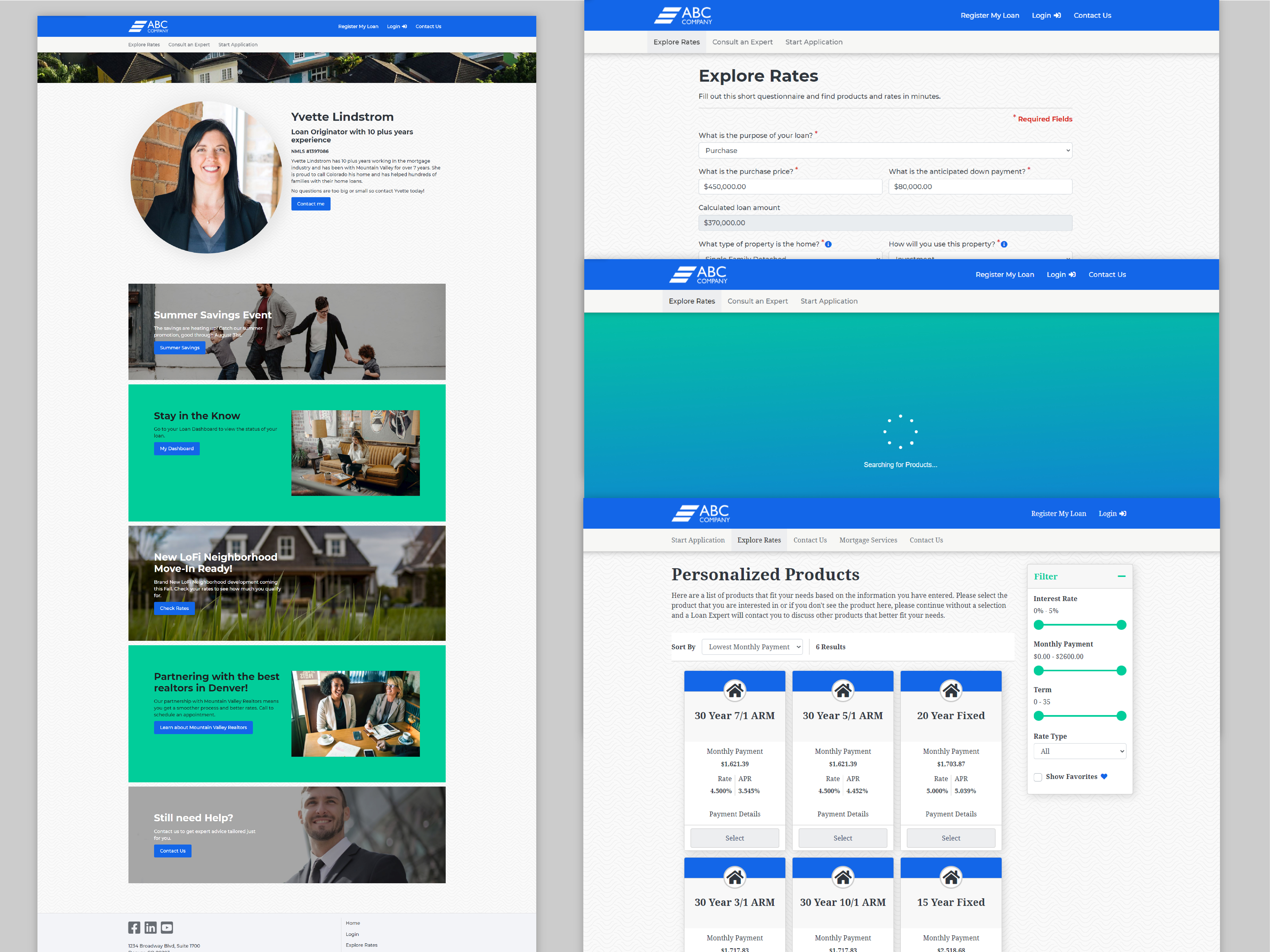
- Causal viewing of available loan products (monthly payments, apr rates and interest rates)
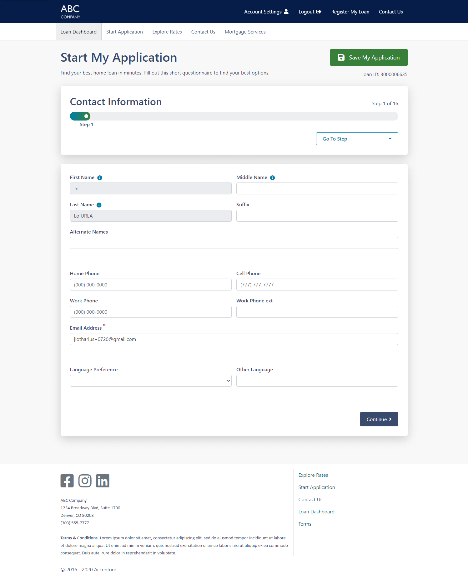
- Applying for and filling out a loan application
- Viewing their loan’s progress
- Communicating with their loan officer
- Uploading documents
- Approve authorizations for credit, employment, etc.
- Viewing available tasks for the borrower
- Signing documents
Some lender workflows include:
- Configuring loan applications
- Setting up child sites
- Theming the site to match branding
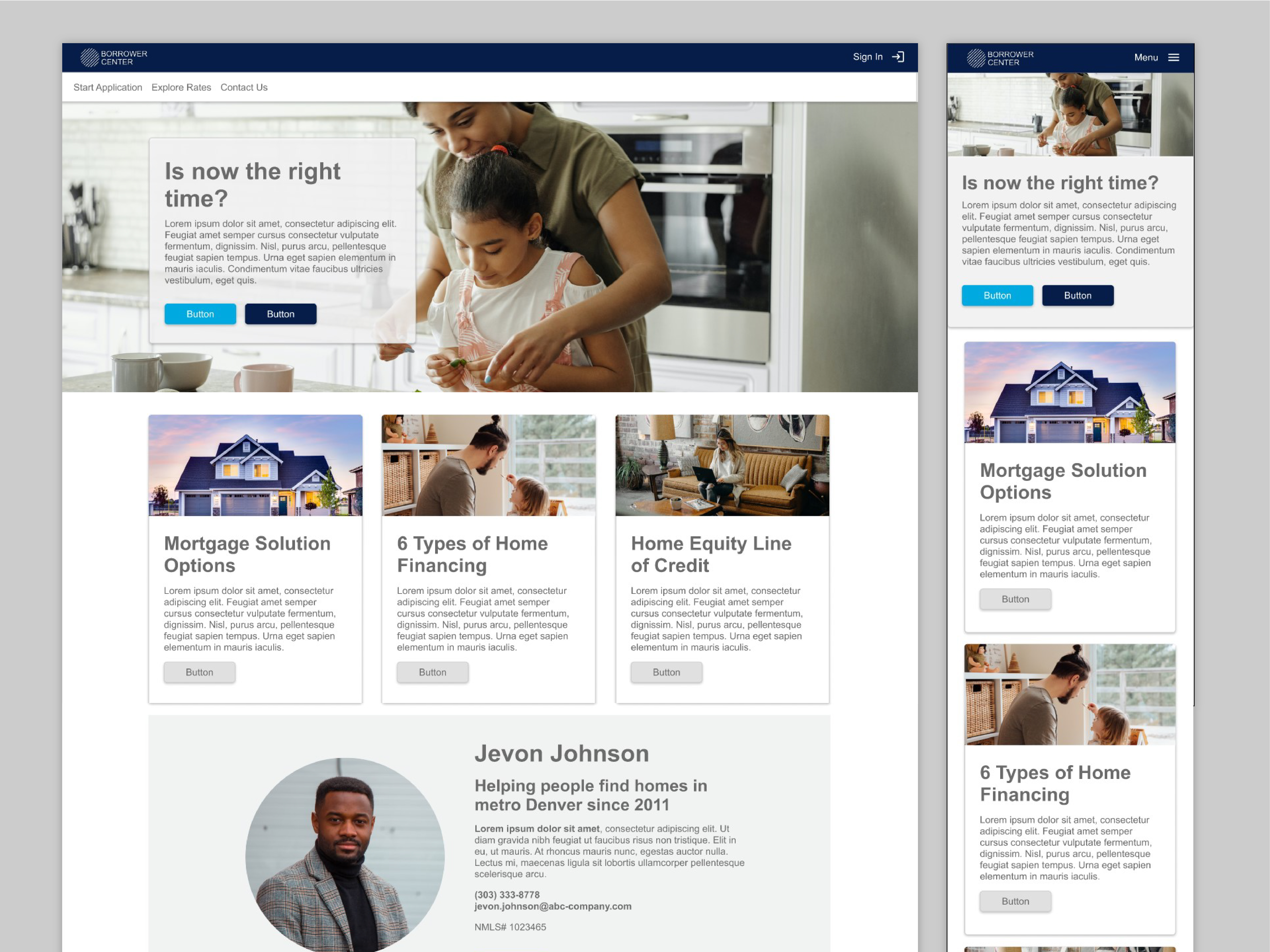
- Configuring marketing pages
- Creating products to offer
- LOS integrations
- Responding back to the borrower
Challenges
Maintaining exisiting sites is always a challenge for enterprise businesses. Borrower Center's teams had to maintain current functionality & integration with the older codebase that would eventually be phased out. There are many mapping configurations and data sets to account for, along with meeting requirements for government backed loans (such as Fannie Mae & Freddie Mac) that are commonly offered by our clients to their customers.
The Borrower Center teams were up for the challenge. I ensured I was available to the development teams when it came questions on the UI design and we even collaborated on the CSS including the theming template for the clients. On the Product side, I brainstormed and Comped out designs that met the requirements of our stakeholders while balancing the needs and requirements of our users.
My Process
Common to enterprise applications, Borrower Center is a live platform and is constantly being updated with new features and phasing out old ones. I worked directly with the Product Owner, Product Manager, and Business Analysts to review up coming features, discuss requirements and priorities and created design solutions. As part of the agile workflow, complex designs were discussed with the lead developers and architect and revisited after each release to the clients.
I also provided support to the UI developers when it came to complex design components, ensuring that each state and element was developed accurately. I worked closely with the QA team to ensure Level AA WCAG 2.1 standards were met for our
public facing platform. This included doing manual checks with screen readers and other online accessibility tools.
Since BC is meant to be customizable for each client, I also created several packs of custom site themes for our sales team for demos.
Accessibility
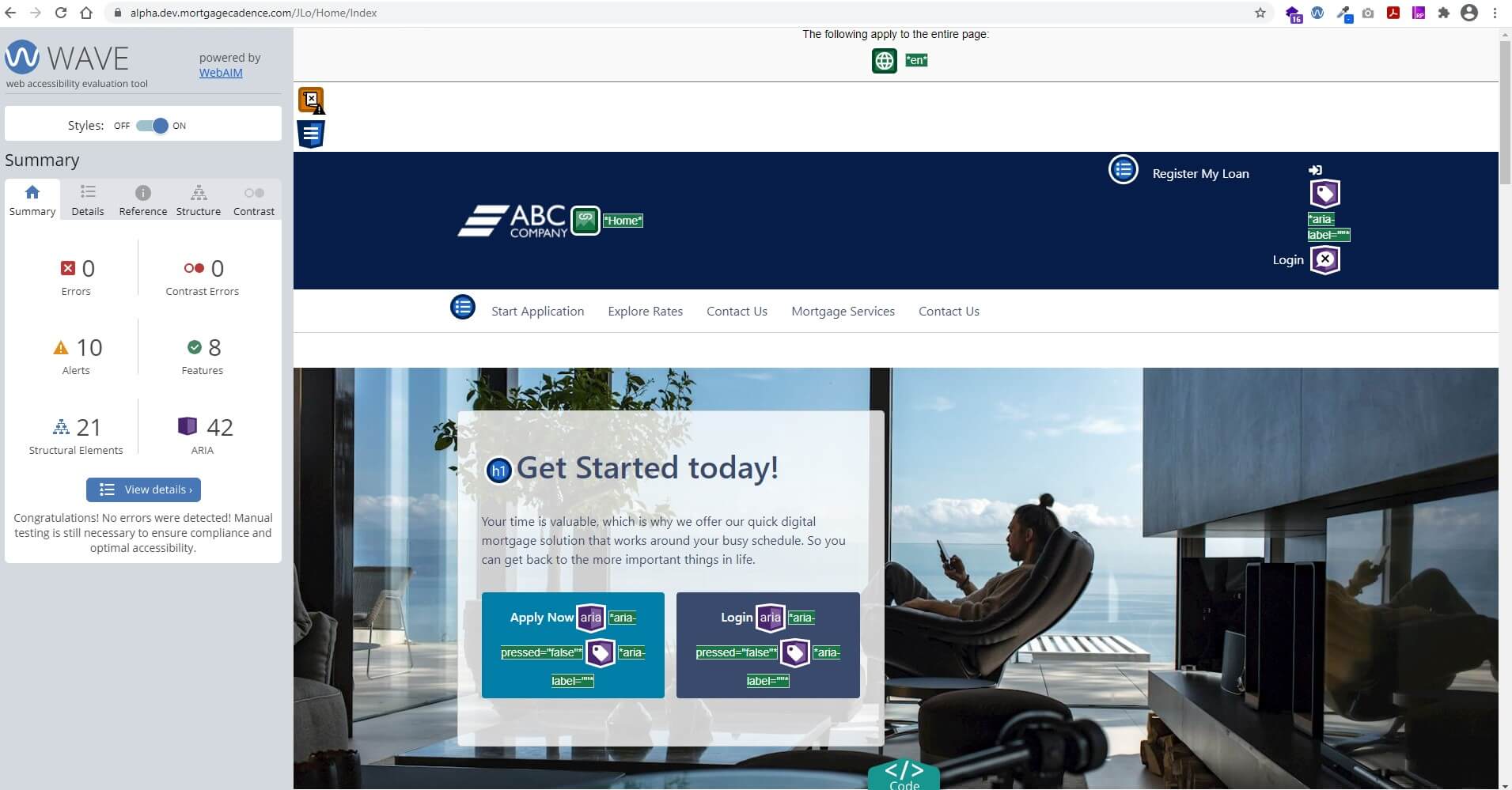
Mortgage Cadence and it's parent company Accenture require any client facing product to be WCAG Level AA compliant. I took lead on this and researched WCAG 2.1 and ADA so that our product would be compliant and accessible for our customers. We tested with NVDA screen reader and utilized the WAVE tool to ensure our product was meeting the standards. One of BC’s features is it’s customizability to match the branding of our clients. To assist with our client’s need to be immediately WCAG AA compliant, we provided our default CSS with high contrast colors to help them get started.
Brand Customization
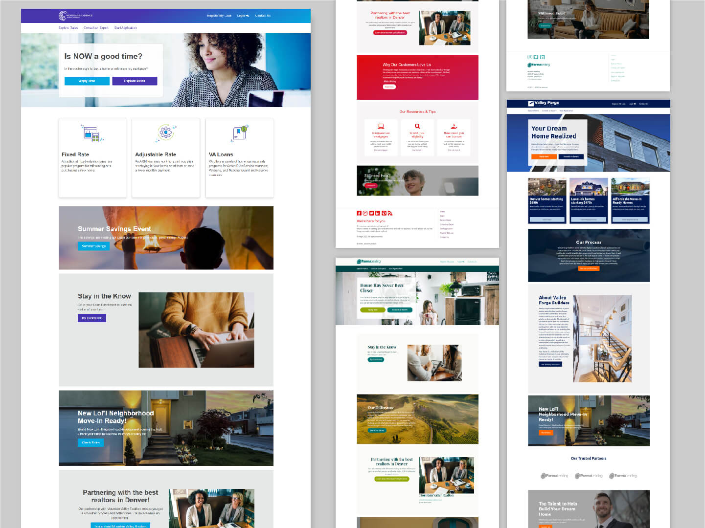
One of Borrower Center's unique offerings as compared to Mortgage Cadence's competitors was the ability to customize Borrower Center to act as seamless experience to their customers. The existing solution for this was to provide our clients with a template, or boilerplate, CSS to be altered to match their branding. As we progressed, I assisted with cleaning up the boilerplate and moving to a more WYSIWYG setup utilizing CSS variables and leveraging Bootstrap and BEM method.
During my time I assisted the sales and marketing teams to create custom CSS demo sites for potential clients. In doing so, I helped introduce content configuration sections for the marketing and home pages so that the clients had more flexibility. I worked closely with the front end developers to make sure these sections maintained consistence with customized CSS configurations.
Design System
My UX team's goal was to create a design system that helped unify Mortgage Cadence's main three products. I had started out with some basic elements to keep for consistency, but as the Borrower Center and later Collaboration Center products continued, I moved our design comps from Axure to Figma. I leveraged Figma's inherit component and variables options to help build up our new design system that would allow for each applications own variations.
Reflections
Borrower Center was a fantastic learning experience and the reason I enjoy working on complex enterprise applications. Seeing a project get built over the years and crafting it to meet the user's needs is very satifying not only to the team but our clients too.
I have developed many strong professional relationships with the team. Our success relied on our ability to be agile with our work, open to learning new skills, and really focusing on the problem we are trying to solve for our users. Their camaraderie was infectious and all were delightful people to work with. These 'soft skills' are what really made the project enjoyable during the ever-evolving complexity of an enterprise application.
< Back to UX