 Jennifer Lotharius Portfolio
Bedizen
I came to this project trying to solve my own wardrobe problem... what should I wear today?Bedizen is a wardrobe app I designed to make it easier to track your clothing and build a capsule wardrobe digitally.Overview
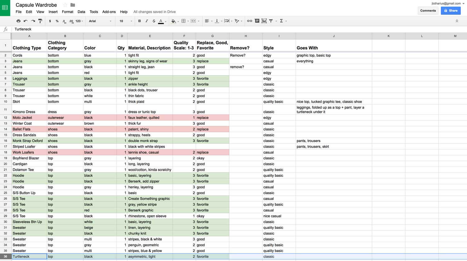
I came up with the idea for Bedizen while I was trying to develop my own method for creating a Capsule wardrobe. I started out by opening a spreadsheet and listing out each piece of clothing I owned and all the data related to each item. Needless to say, I was scanning through my spreadsheet thinking there had to be a better and more visually pleasing way to do this. I looked up any potential wardrobe apps on iTunes and Google Play and only found very ugly interfaces or really expensive ones that didn't quite have what I wanted.
I decided to create a wardrobe app using my own design and development knowledge and build it out as far as I could.
Core Features I worked on
- Branding
- UI Design
Skills Utilized
- UX Research
- Information Architecture
- Work and userflows
- Wireframes, Style Tile, Visual Design
- Prototype
Challenges
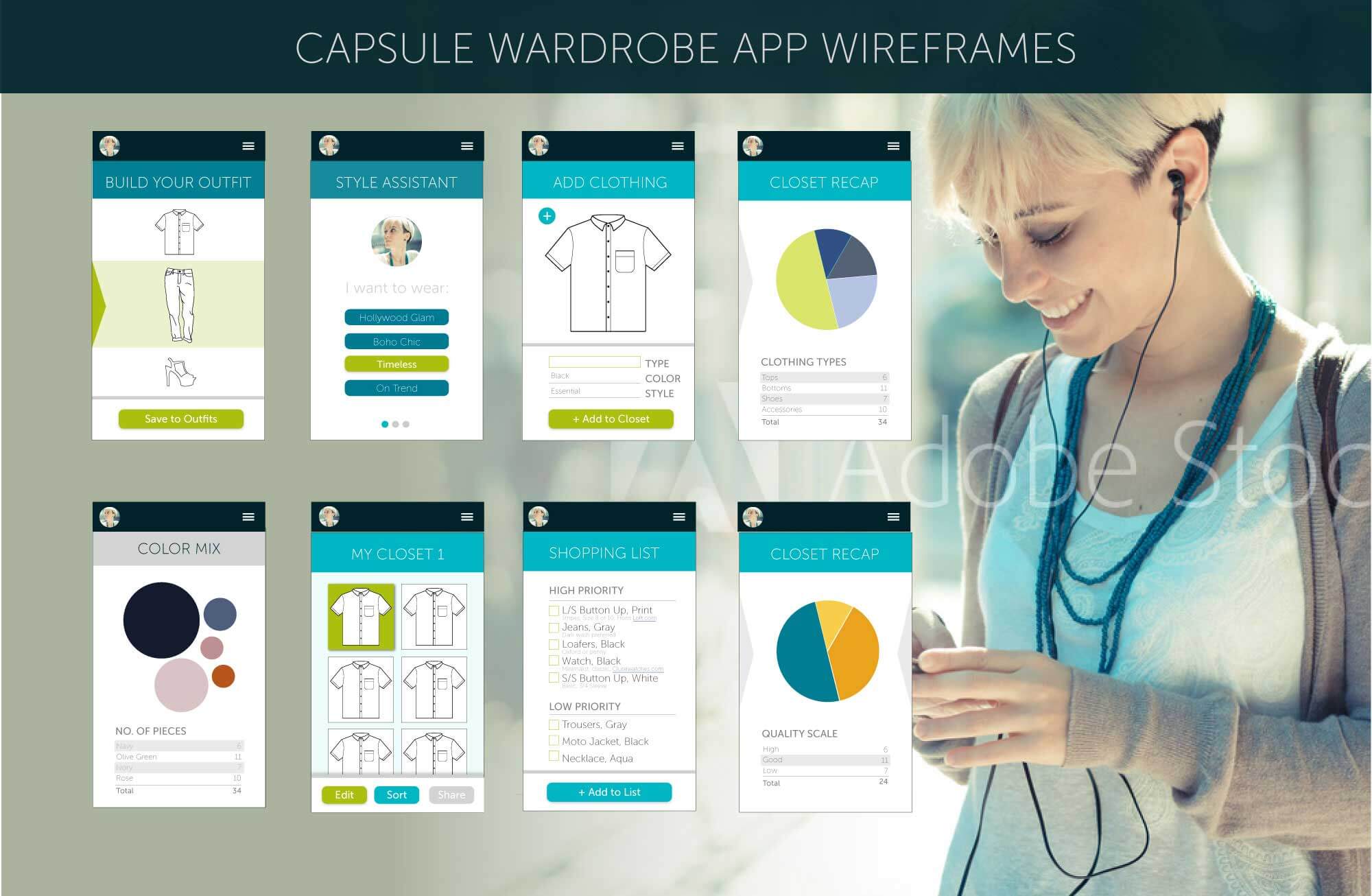
In my intial round, I designed the first set of comps based on which features I would love to have. Some features I really wanted was a an 'outfit builder' and a live shopping list connected to the wardrobe. Another feature would be a visual way to display the wardrobe's 'status' reporting the number of tops owned, or the color mix of the wardrobe. The main goal was to instantly see what 'holes' a user had in their wardrobe as a guide to help fix them.
Competitors
When I initially checked, I didn't find any competitors that were making a wardrobe or capsule app. It wasn't until later in 2016 that I found Cladwell, whom was targeting men and their sister company Capsules, that was targeting women. I decided to position my app towards young and trendy women with an emphasis on making the app experience be fun to play around in. Even if this app wasn't successful, if I could build it and use it myself, I would count that as a win.
Personas
I discovered 2 personas while running through the User Centered Design (UCD) process. The primary user was Jamie, a 20 to 30 something who wanted a fun and easy way to create a capsule wardrobe. The secondary user I discovered was Kate, a fashionista who has professional or aspirational goals of becoming a style consultant. She could use the app as tool to help build suggested capsules for her clients.
User Surveys
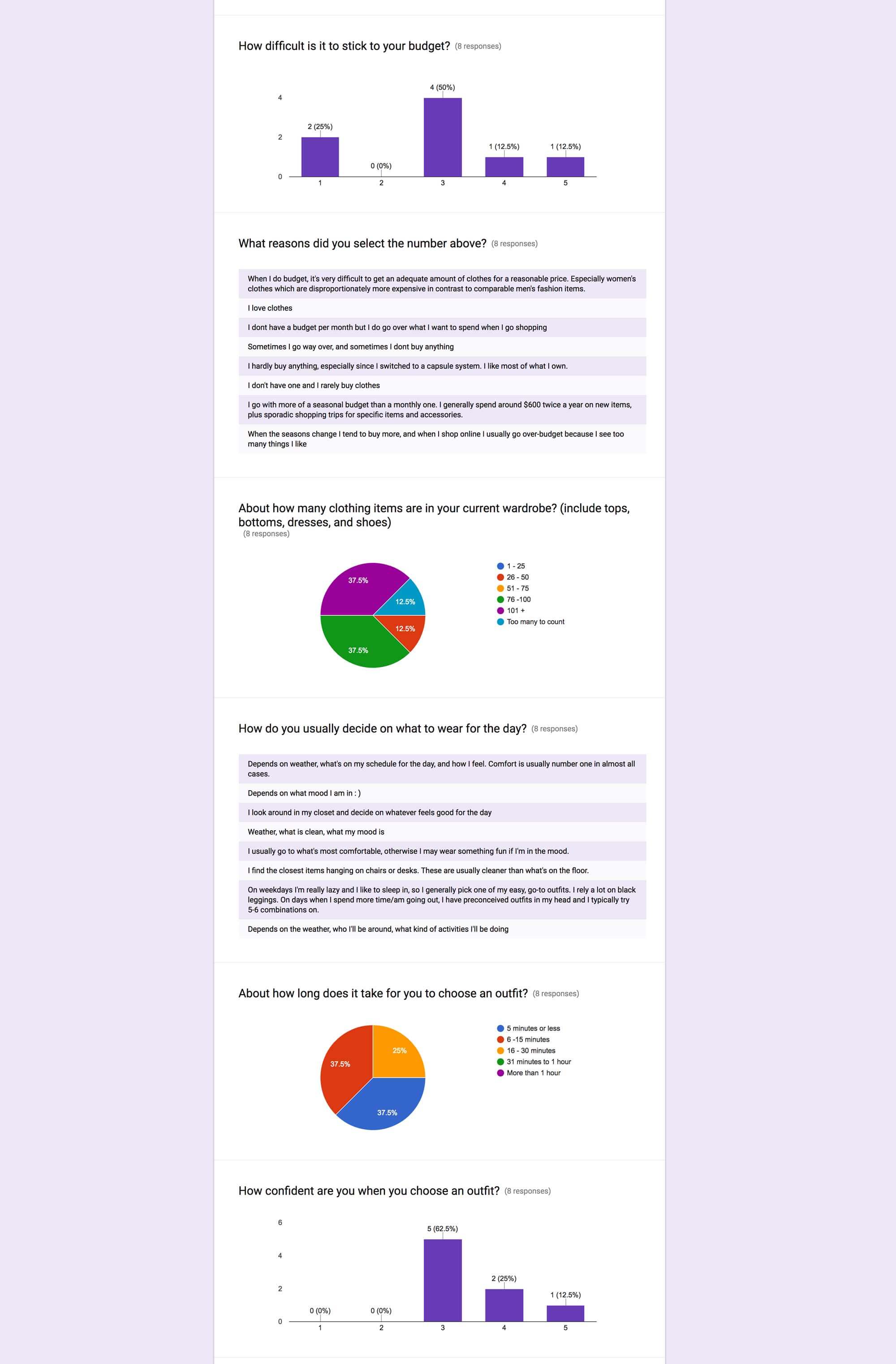
After some research into my primary user, I created a simple survey and sent it out to people within the target demographic. I gained some interesting insights, such as most people check the weather before they decide what to wear. I know this sounds like a 'duh' moment, but I thought it would be another fun way to make the app more seamless by adding a quick weather check at the opening of the app to help the user choose an outfit.
Experience Mapping
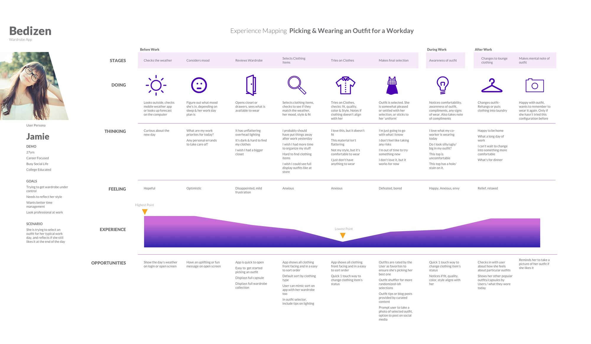
After I gathered my information from the surveys, I created an Experience Map to help understand how my user would interact with the app throughout the day.
Card Sorting
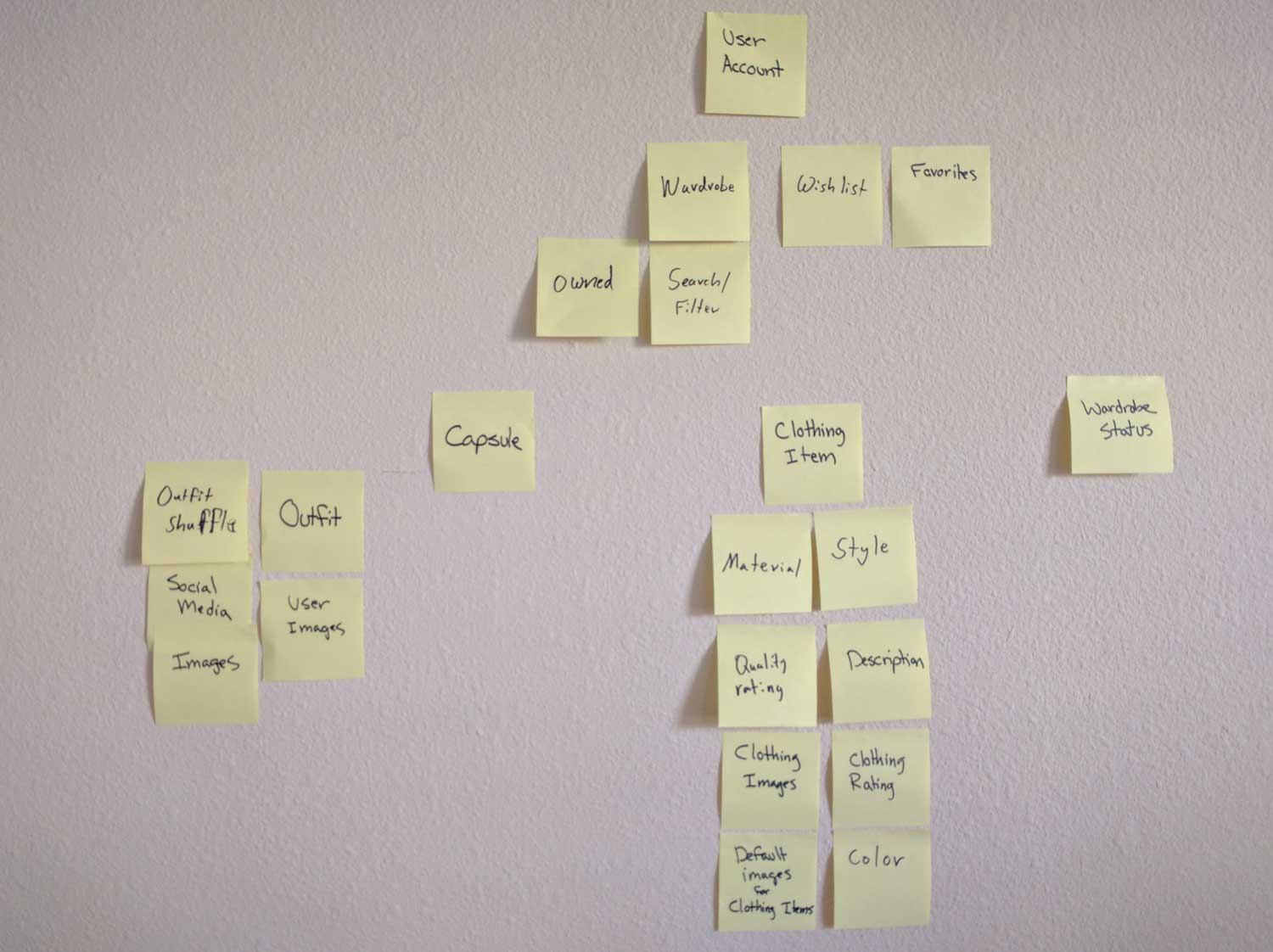
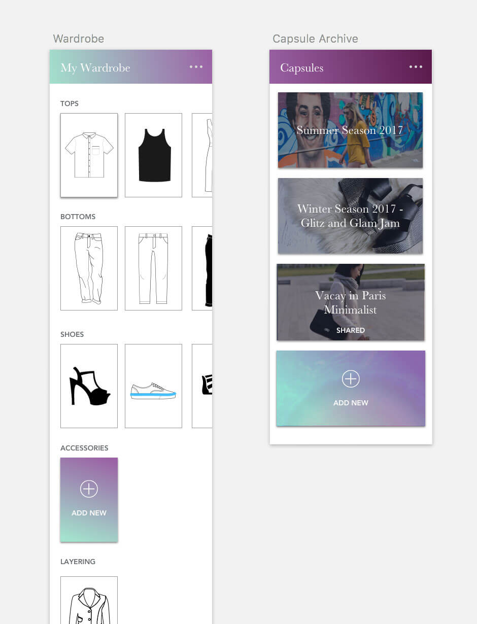
After listing out all of the types of data it would need, I conducted a card sorting session with my partner. I determined at this stage that a 'Wardrobe' would be defined as the user's entire clothing catalogue. However, a user could have multiple 'Capsules' within their Wardrobe, and each of those clothing items must come from their Wardrobe. The social aspect of the app would consist of people building their own capsules and sharing that capsule set with others by adding it to their Favorites. Then it would be added to the User's Public Favorites list.
However, this brought up the issue of whether a User must own that particular piece to be added to the User's Wardrobe, or would there be a separate section for un-owned pieces? I settled on the idea to include each piece that wasn't owned by the User, to be automatically added to their Shopping List.
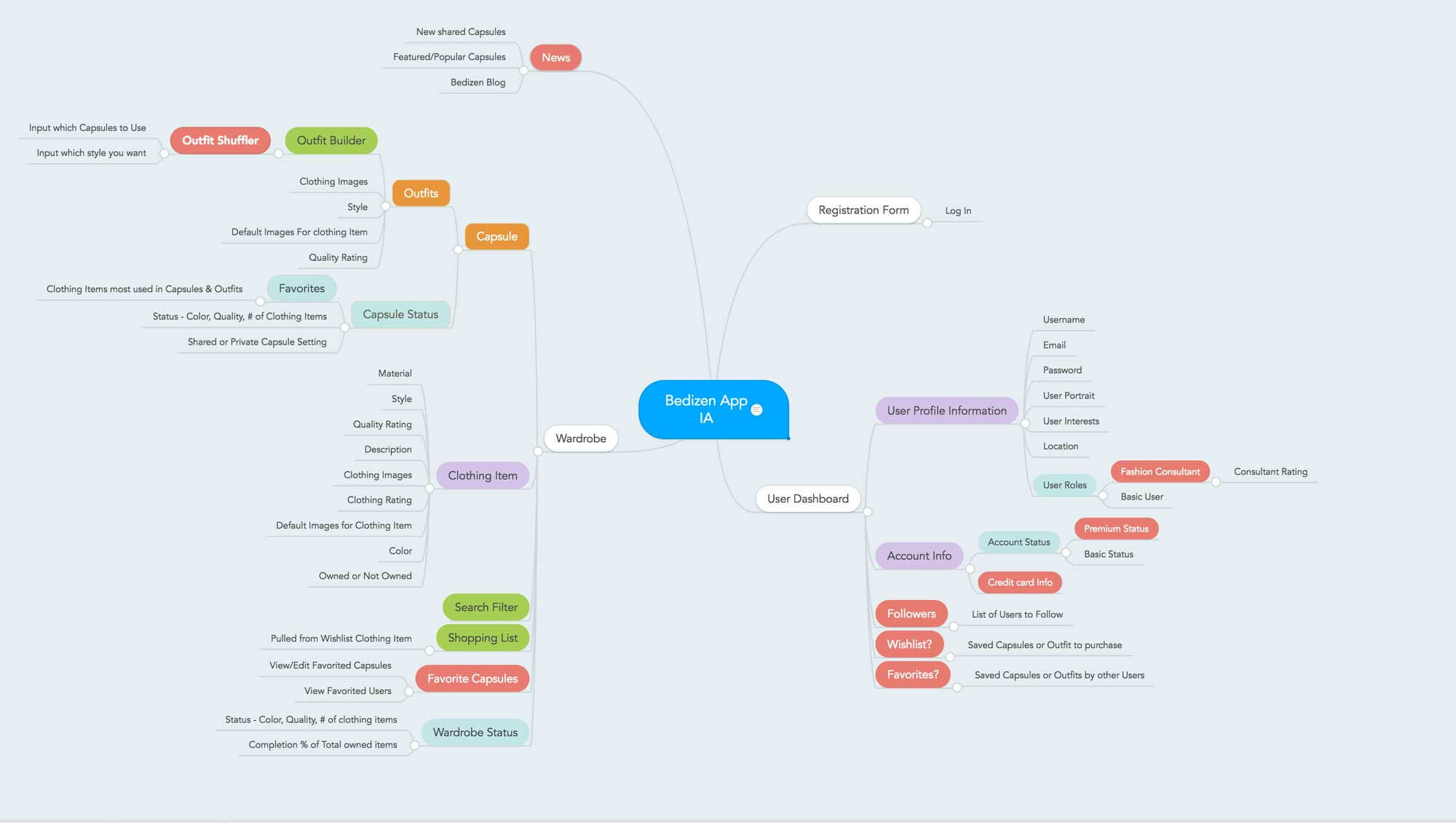
Information Architecture
After my partner and I sorted the cards, I switched over to sorting the information digitally and created a site map showing the informational hierarchy and sorting out which features were 'in scope'.
The information architecture at this stage was crucial to determining how I would design the app. Many questions I had were how each piece of information would relate to one another.
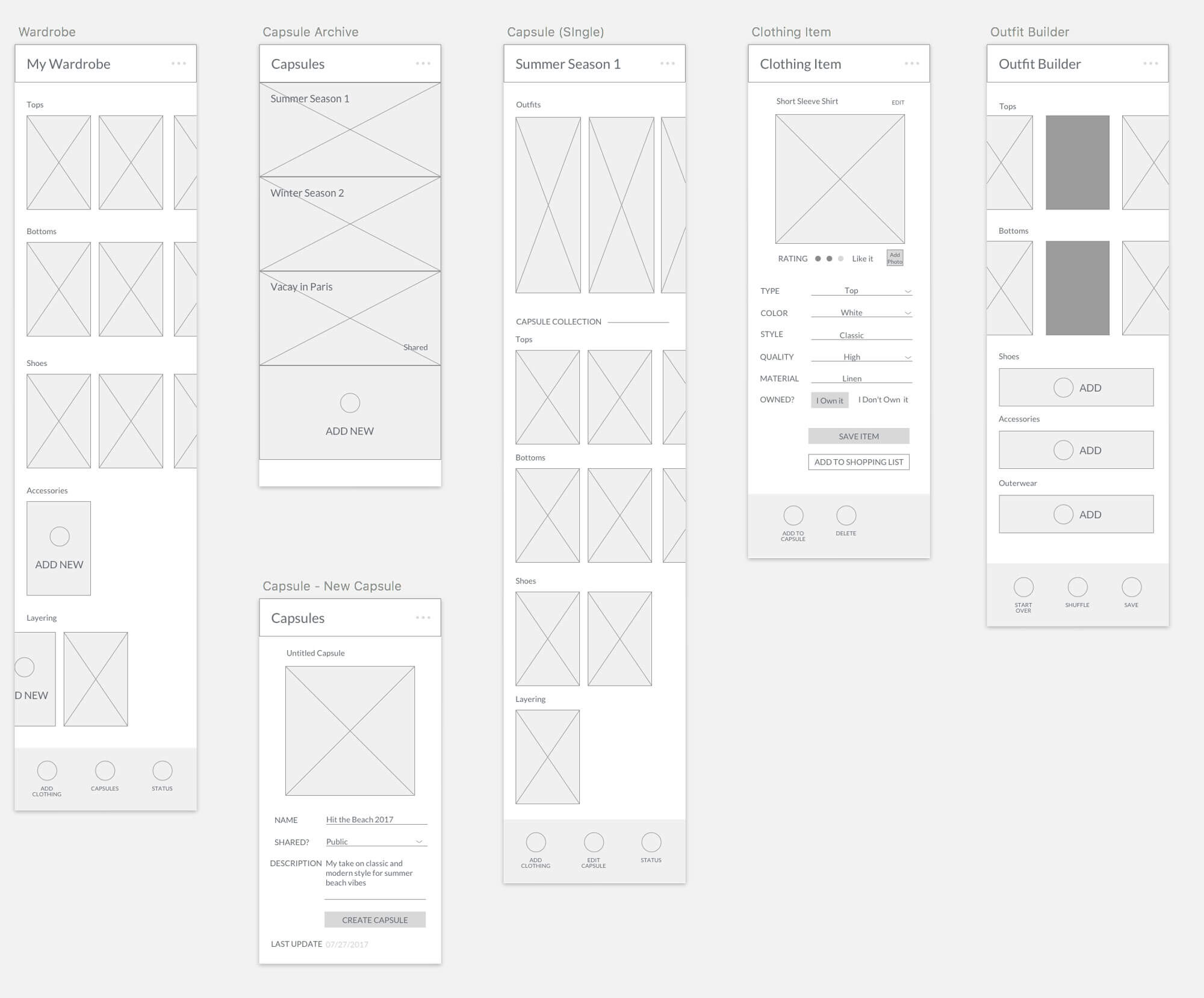
Wireframing
I initially sketched out some layouts on paper, and then switched over to Sketch and built out the wireframes. I decided to go with the mobile design first and then run through the desktop after working out the core features on mobile.
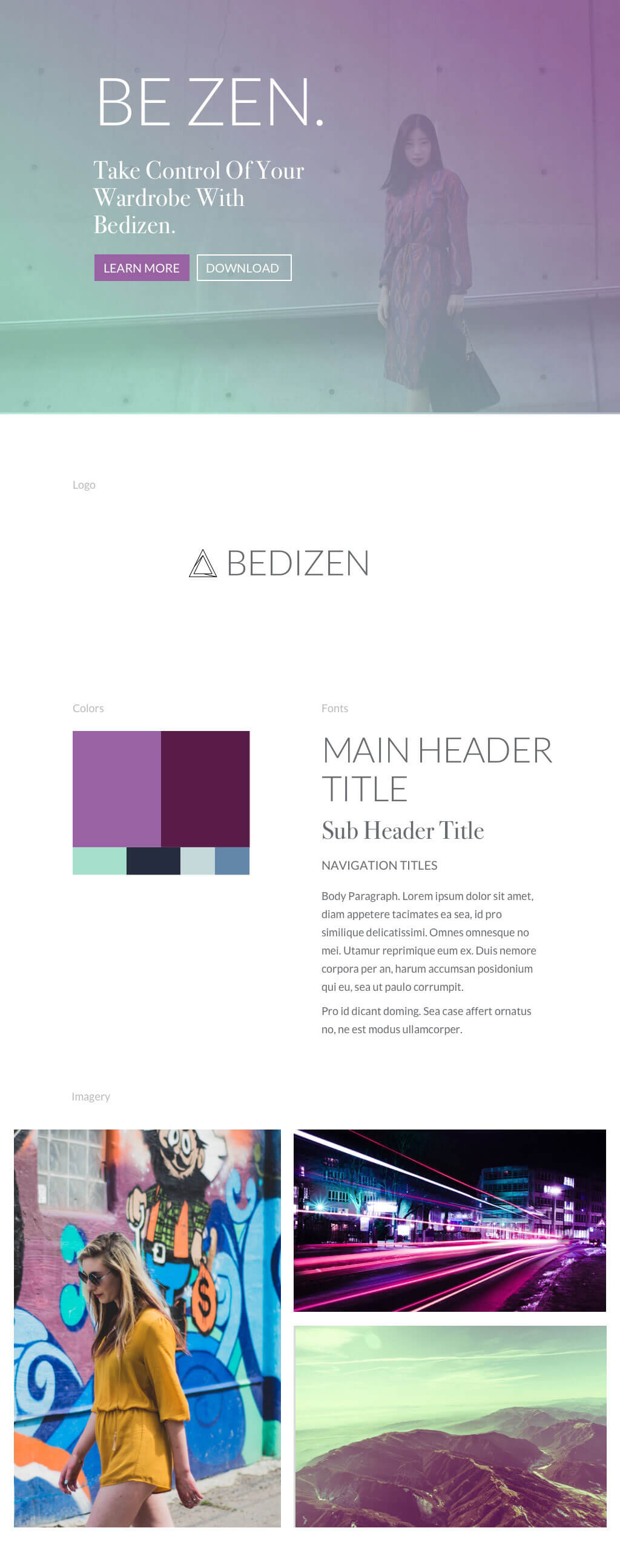
Style Tile
I really wanted the app to look and feel fun to use, I included fun colors that would look good blending together, as I was very inspired by the ombre hair color trend at the time. I also decided on a serif font to use for headers and a clean sans serif to do the heavy lifting for the body copy.
I made future plans to have professional photos/video taken. I also decided to hire an illustrator to start off with around 50 default illustrations for the app.
Comps Research and Visual Design
The Comps stage took quite a bit of time. It also helped me breakdown how I wanted to display all of the core design elements. Some tough areas where figuring out how I wanted to display a single outfit.
I had difficultly figuring out what menus should show at all times. I left this somewhat loose until I got the the prototyping stage, as it would be more easy to test and apparent how to the navigation should flow During this stage I also discovered I should include a "Add Clothing" wizard just to help guide the user to set up adding their clothing items Since the Social aspect of this app would be Phase 2, I didn't include those elements, but I did anticipate them for the future design Another tough area was determining how I would display an Outfit. I played with a lot of layouts and settled on a collage layout, similar to the one on Polyvore. I also made the decision that each outfit could only contain 6 pieces max, as it would get out of hand to show the look of the outfit, plus one can get a general idea from the base outfit and add further pieces/accessories, but the outfit would still hold up.
Prototype
Finally, I created a prototype using Sketch and Principle.
Reflections
Bedizen was a great project to practice the User Centered Design process. With my knowledge today, I would apply the Lean Agile method, and not just follow every step as a checklist.
And while a wardrobe application may be an overused concept today (apparently it's a common prompt used at UX bootcamps!), I wouldn't mind someday coding it out in the future just for fun.
< Back to UX