Collaboration Center
How does the mortgage industry speed up loan processing? By connecting everyone to communcate in the same platform. Collaboration Center was created to connect everyone in the mortgage industry who touches a loan to collaborate in one secure location.Overview
The mortgage industry full of complexity, and without any standards when it comes to processing a loan. This also comes with a many points of security issues and potential for fraud. My team's main concerns focused on creating trust and transparency for both the borrower and lender. Borrowers not only needs to fill our a loan application accurately and securely, they also need to track the progress of their loan and upload & sign documents directly through the web application, expediting the process and providing transparency. Lenders needed an easy to setup web application that they could customize and configure to their company's requirements as well as styling the site to match their brand.
I also took lead on pushing our product's accessibility, including following the WCAG 2.2 guidelines and worked with a third-party to help product a VPAT.
Core Features worked on
- Loan focused workflow
- Messaging, Orders, Files, Contacts
- Integrated web component
- Admin configuration for clients
Skills Utilized
- UX Research, Brainstorming, Stakeholder Coordination
- Work and userflows
- Accessibility Lead & Implementation
- Art Direction and UI Design
- Assisted in CSS client setup & tutorials
Industry Position
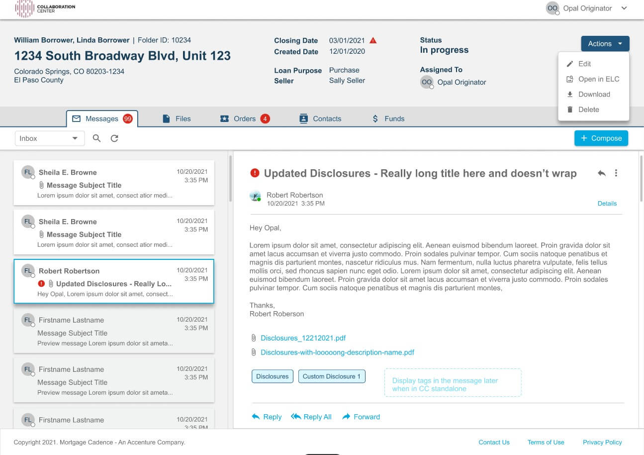
Mortgage Cadence provides an integrated digital platform for borrowers, lenders, and financial institutions as part of the home mortgage lending process. It’s core products Mortgage Cadence Platform LOS (B2B), Borrower Center (B2B, B2C), and the Collaboration Center (B2B, B2C) provide and end-to-end solution to thousands of lenders, borrowers and other mortgage industry providers, operating over $1 million in valuable products.
User & Workflows
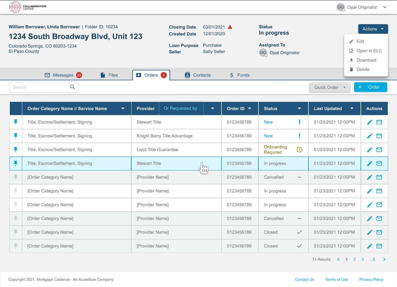
The mortgage industry is rife with many complex workflows. Our goal for CC was to create a secure, one-stop messaging platform that automatically handled security and workflow requests in a simplified manner. One of our goals was to help our loan officers view their pipeline and communicate with the right people on the loan, quickly and efficiently.
Some typical user flows include:
- User onboarding
- Transaction flows
- Requesting and processing orders
- Person-to-person communications between lender, borrower, & other parties
- File organization & transference
- Managing teams loan workloads
- Viewing reports
Challenges
Collaboration Center was incorporated to Mortgage Cadence as an existing product. The team was small but could perform at a high capacity. Prior to my joining the team, they had not had experience working with a UX Designer before. I had to build trust with the team and provide guidance without causing confusion over role responsibilities.
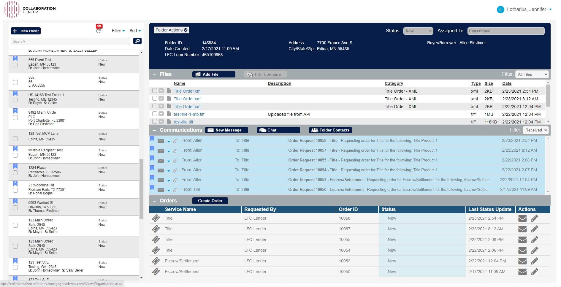
Not only was the CC product was in need for much needed face-lift, it also had many issues with user onboarding and error recovery. The team was also short a Product Owner resource, which led to confusion over new feature priorities versus existing issues that needed to be addressed.
The existing version of Collaboration Center was full of information architecture and ux design issues. Without a UX designer, front-end developer or product owner, the product had lagged in servicing the client needs. This lead to many missed opportunities and consistently "patching the leaky ship". After I and the others joined, we set about looking to rebuild the bones of the application with modern SPA technology, utlizing front-end frameworks (such as Bootstrap) and fix the many frustrating user experience 'dead-ends' our current clients were facing.
With all of the functionality we wanted to accomplish, my goal was to make it easier for the user to access and use the platform to manage their communications quickly and efficiently.
Personas
CC has two main user groups, the front line worker such as a loan officer or title agent and the team manager.
Early on the main user focus was for a lender, but it’s future goal was to include multiple people from the industry (ie realtors, loan officers, title agents) each with their own priority of user flows and needs. During design discussions with the team I was able to surface the need to account for different roles such as Standard Users, Operation Admins and Business Owners. This was a particular point of discovery for the team since these roles had not yet been clearly defined within the product, leading to many support bugs/calls & hot fixes.
My Process
My goal with Collaboration Center was to create a simple and trusted design to build confidence and ease the workload for a variety of mortgage industry professionals.
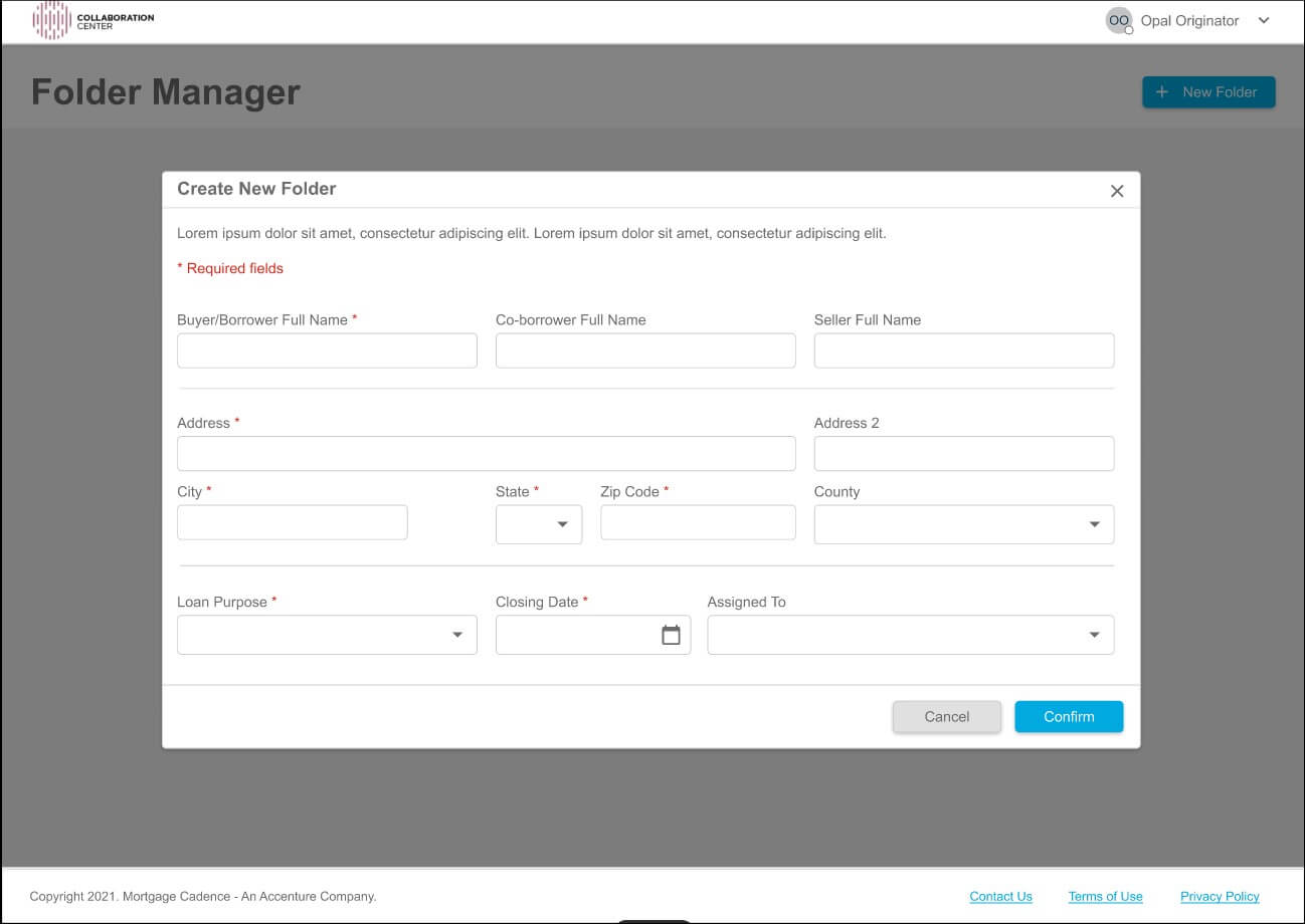
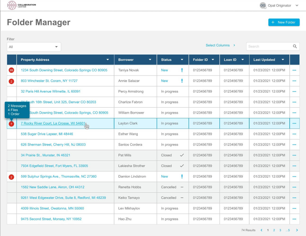
With all of the current tech debt Collaboration Center was exisiting on, I had to focus on the future design. The Product team and I spun on many early feature ideas that I disagreed with on the priority level (a chat feature that was very underutilized). By staying focused, I was able to create a system of Comps that could take on the huge task of a functional collaboration tool.
This project is still ongoing, and I hope to see it completed in the near future.
Accessibility
Mortgage Cadence and it's parent company Accenture require any client facing product to be WCAG Level AA compliant. CC is in progress to become WCAG 2.1 compliant when the web component is released so that any webpage containing it will still be accessible.
Embedded Web Component
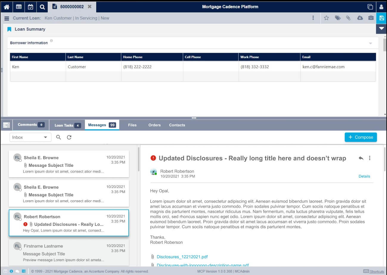
One future goal for Collaboration Center was to fully integrate it with MCP, Mortage Cadence's main LOS platform. It would also integrate with Borrower Center, allowing the borrower to directly communicate with the people working on their loan in a secure application. With this embedded web component, Collaboration Center could then be installed into our clietn's own web portals.
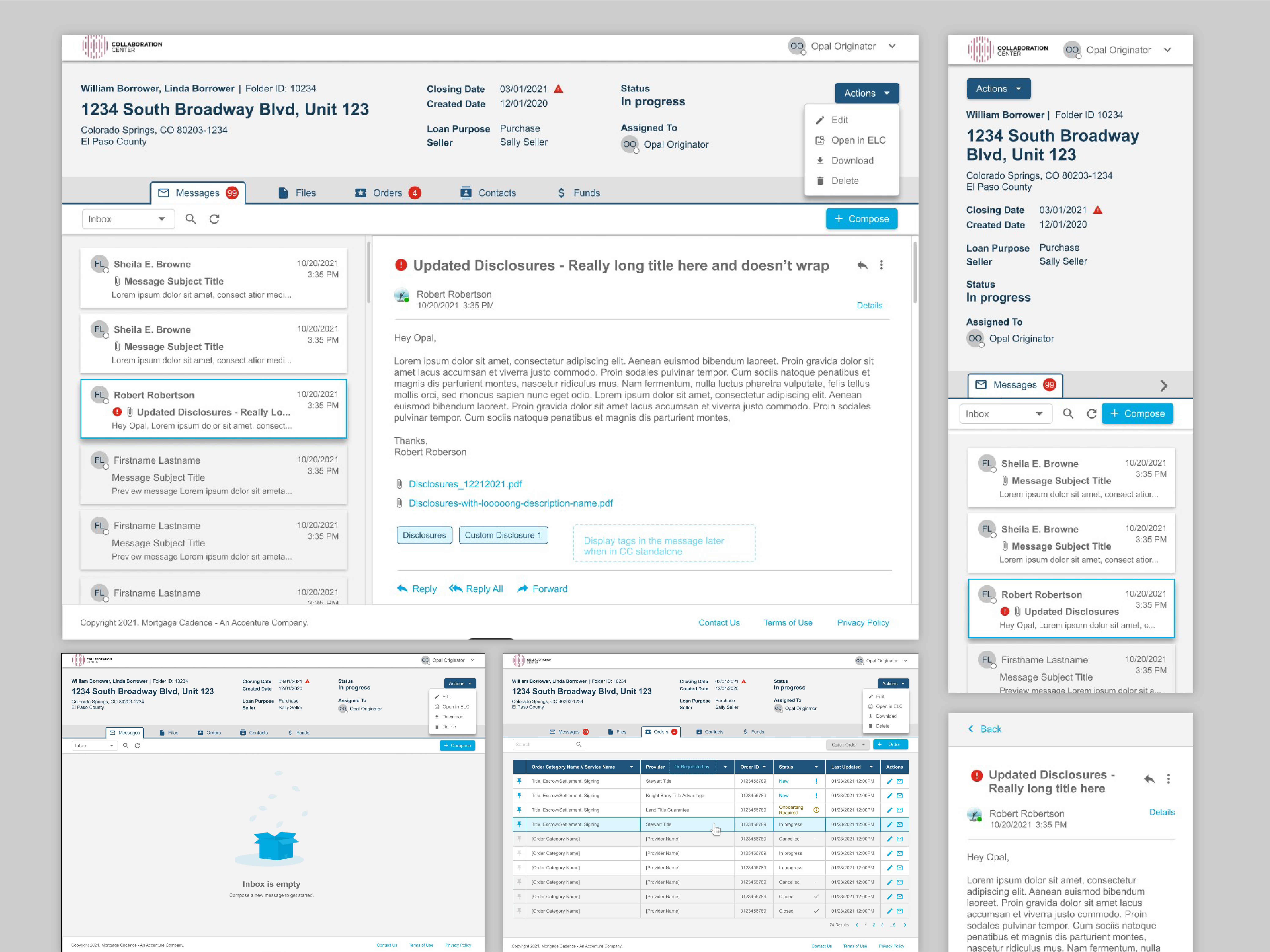
With this in mind, I designed the 'stand-alone' version of Collaboration Center in a piecemeal fashion, so that the lower half of the application could be the embedded web component. I also had to make sure the design would be WCAG 2.1 compliant since that was a Borrower Center requirement. All of this, including responsive design and factoring in the MC Design System made this one of the most complex enterprise applications I've worked on.
Reflections
There will always be a limited number of resources or product requirements to work into the UX design process. This project has taught me to be very communicative and clear on the restrictions of the codebase. Probably one of the best skills a designer can learn is strong communucation and persuasive skills.
< Back to UX