Multiversity Comics
Right before the big Marvel movie boom that lifted the comics industry to new heights, Multiversity Comics was there to provide honest reviews and interviews with the comic book industry's top creators and beloved indy darlings.Overview
Multiversity Comics is a well-known blogging and general review site for comic book lovers. Their goal was to build their credibility with their core readership and be the go-to place to catch the latest comic book news.
Skills Utilized
- UX Research, Brainstorming
- Client Presentation
- Information Architecture, Site Mapping
- Wireframes, Style Tile, Comps
- Front-End Development
My partner, Devin Kendall assisted me on the design and development of this project. He also handled the backend development and database setup.

Challenges
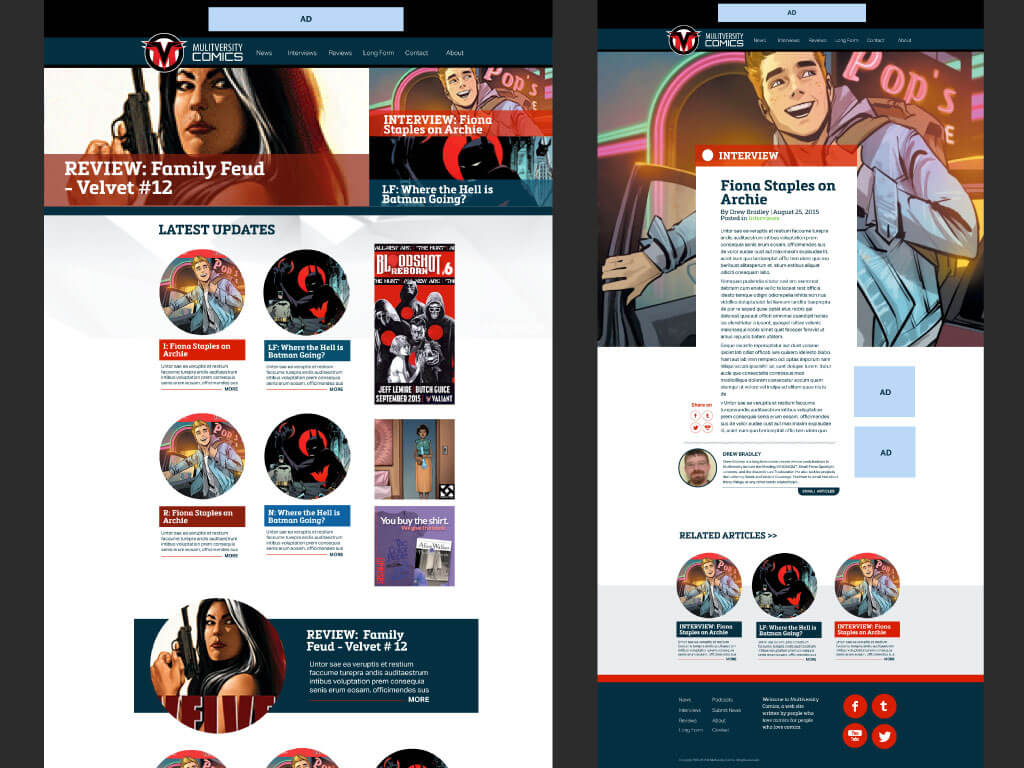
Their old site was built in Wordpress, but it had a stodgy and ineffective layout and issues with site updates. Much of the content was hard for their users to find and they wanted to bring to attention several new categories on the homepage. The client also requested a stronger hero section to direct readers to their top 5 featured posts.
Solution
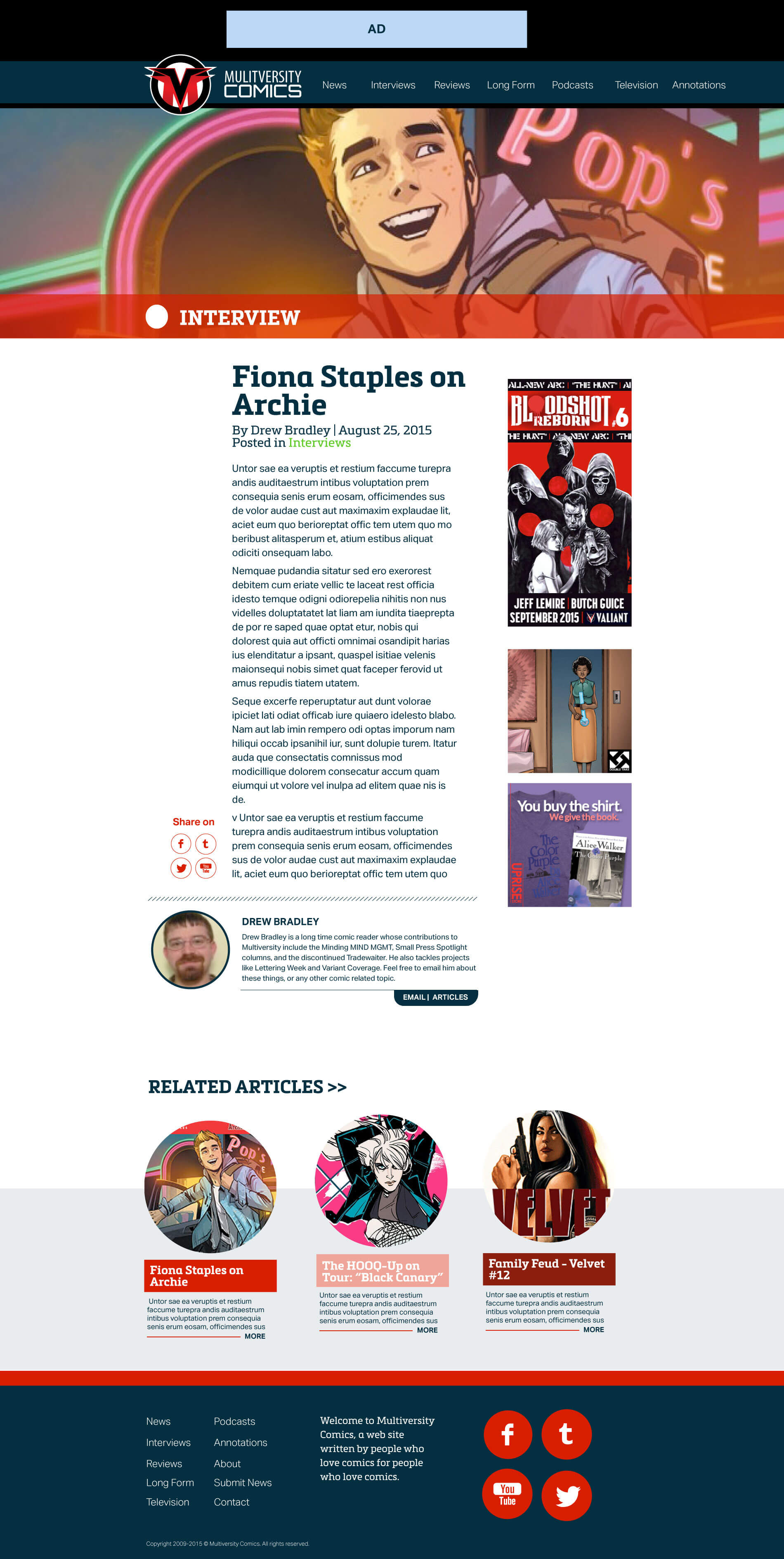
There was quite a bit of early research to understand the categories and how to layout the content for the user, as well as heavy research into the development of the site to fit the our client's needs. I presented the client with a brand new look utilizing color categories and circle design elements to match the look and feel they had established with their new Multiversity logo. The featured hero section contains the top 5 posts and was created with the option to curate it. We built the site by creating a custom Wordpress theme.
Careful attention was also given the responsive design of the site since they had a high percentage of mobile readers.

Reflections
Multiversity was one of the earliest projects where I worked on both the design and front end development. Looking back on it, I can see that I underestimated the amount of work that the entirety of the site entailed. Thankfully, I had my partner Devin to lean on, and we both came away learning a lot about what goes into building and designing a custom themed Wordpress website.
< Back to UX